One of the consistent criticisms I've received for Shift Happens, my debut novel, is its lack-luster blurb. I don't want to repeat the same mistake twice. Below is my draft blurb for the second book of the series, Beast Coast. It has to stay under 150 words. It's currently 144 words. Ultimately, the decision and blurb rests in the hands of my publisher, but I'd like to be happy with what I submit. What do you think? Suggestions? Would you buy the book (assuming UF/PNR is your thing)? Note: This is an adapting post, so please read through the changes, as some have been made since the original post. ********************************************************************** Original Blurb: In a city known for its diversity, unique cityscape, and picturesque views of snow-capped mountains and deep blue seas, Agent Andy McNeilly uses her unique ability to shift into multiple shapes to keep a leash on All-Things-Weird for the Supernatural Regulatory Division. But hidden...
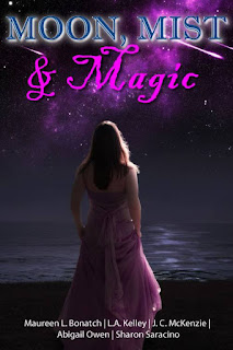


I love the title.
ReplyDeleteI vote for the moon shot, but I would change the color of the lettering. The light pink looks weak to me and I'm not sure that I like the change in font within the title.
That's my two cents.
It's going to be great.
Best
Jo-Ann
Thanks Jo-Ann. I kind of like the title font. I feel it contrasts with the boldness of the background, but to each their own, and Ill definitely pass on your comments. :-)
DeleteI honestly think they're both good covers JC (and I have no problem with the title font). I tried to pick one or the other, but while the moon shot is more dramatic, the woman seems to appeal to me more. A non-answer, but one that says either would work.
ReplyDeleteLOL! A non-answer it is. Thank you for the feedback :-)
DeleteWow, JC. They're both so good. Mathair and I were torn for a while, but we both agree that the girl cover is very powerful and leaves such a statement. It's very fluid and ethereal.
ReplyDelete